UX/UI DESIGN - Bob’s Discount Furniture
Introduction
Bob’s Discount Furniture’s mission is to be the leading omnichannel retailer of value-priced furniture and home goods in North America.
To achieve this goal, Bob's realized they needed to provide a best-in-class digital shopping experience for both in-footprint and nationwide customers.
We re-imagined the entire buying experience from exploration to checkout.
My Role
Sr. UX/UI Design
Deliverables
Immersive discovery workshops, Stakeholder interviews with working sessions, Usability testing via the UserTesting platform, End-to-end design: User Flows, Roadmaps, Stakeholder alignments, Low- and high-fidelity wireframes, Style guides, design systems, specs, and engineering handoffs
The Ask
Improve the overall online shopping and brand experience by:
Driving a full-room selling experience to encourage product discovery and conversion
Create a modern and elevated style that champions the brand
Define a quick and easy path to purchase that includes upselling opportunities
Rethink how products are presented on the PDP and PLP
Offer opportunities to build repeat customers
Providing a platform for ambassador-generated content
Collaborative Workshops
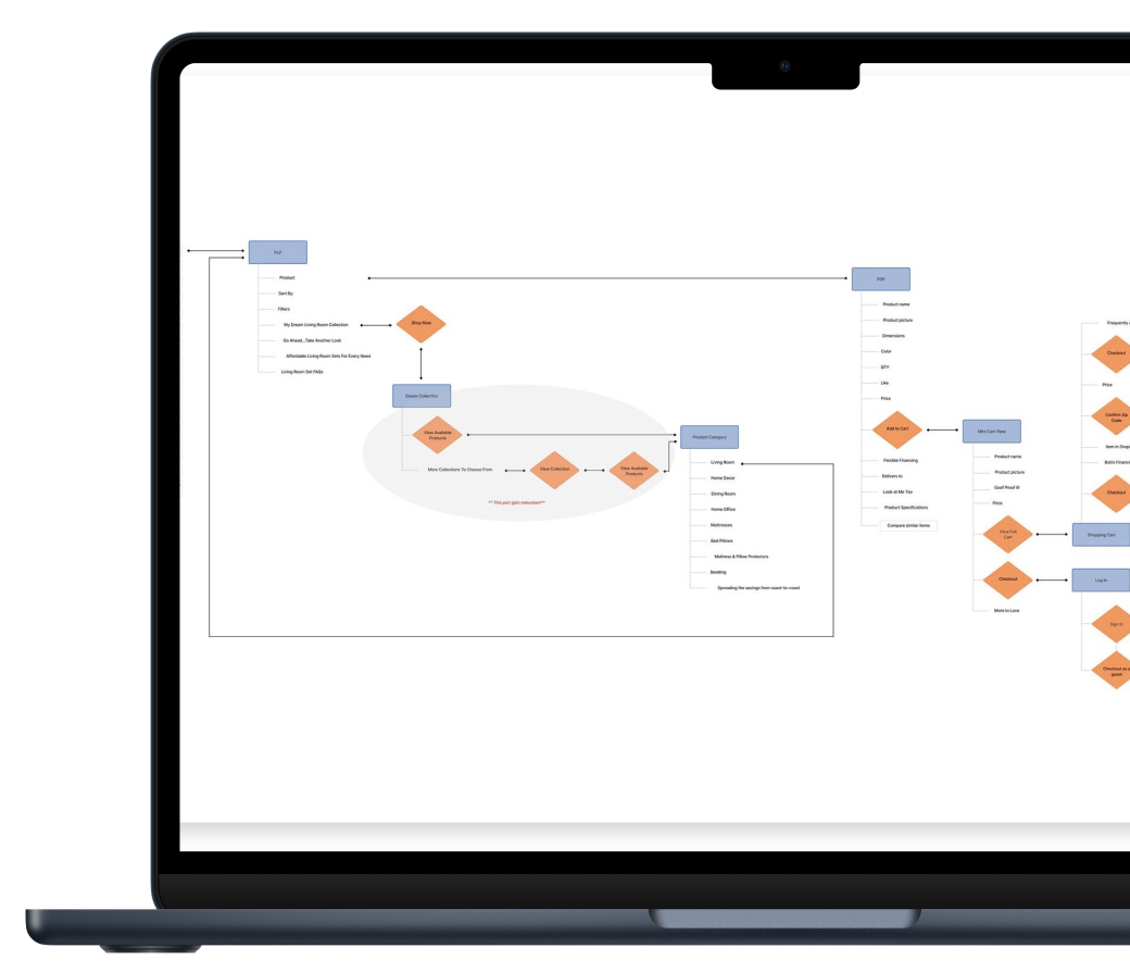
Using Miro as a remote collaboration workspace, Capgemini and the Bob’s teams were able to audit the current site navigation, shopping journey, and checkout journey to identify gaps in the experience.
We created visuals on-the-fly during meetings to work through concepts and flows and find comparative examples in the industry for reference.
Shopping Flow
To move forward with an enhanced checkout experience that included a delivery scheduler, we needed to understand the current state flow, technical barriers, and possible error experiences. To define the happy path and possible detours for the end user, the Capgemini team and Bob’s functional and tech teams spent hours collaborating to create the final solution.
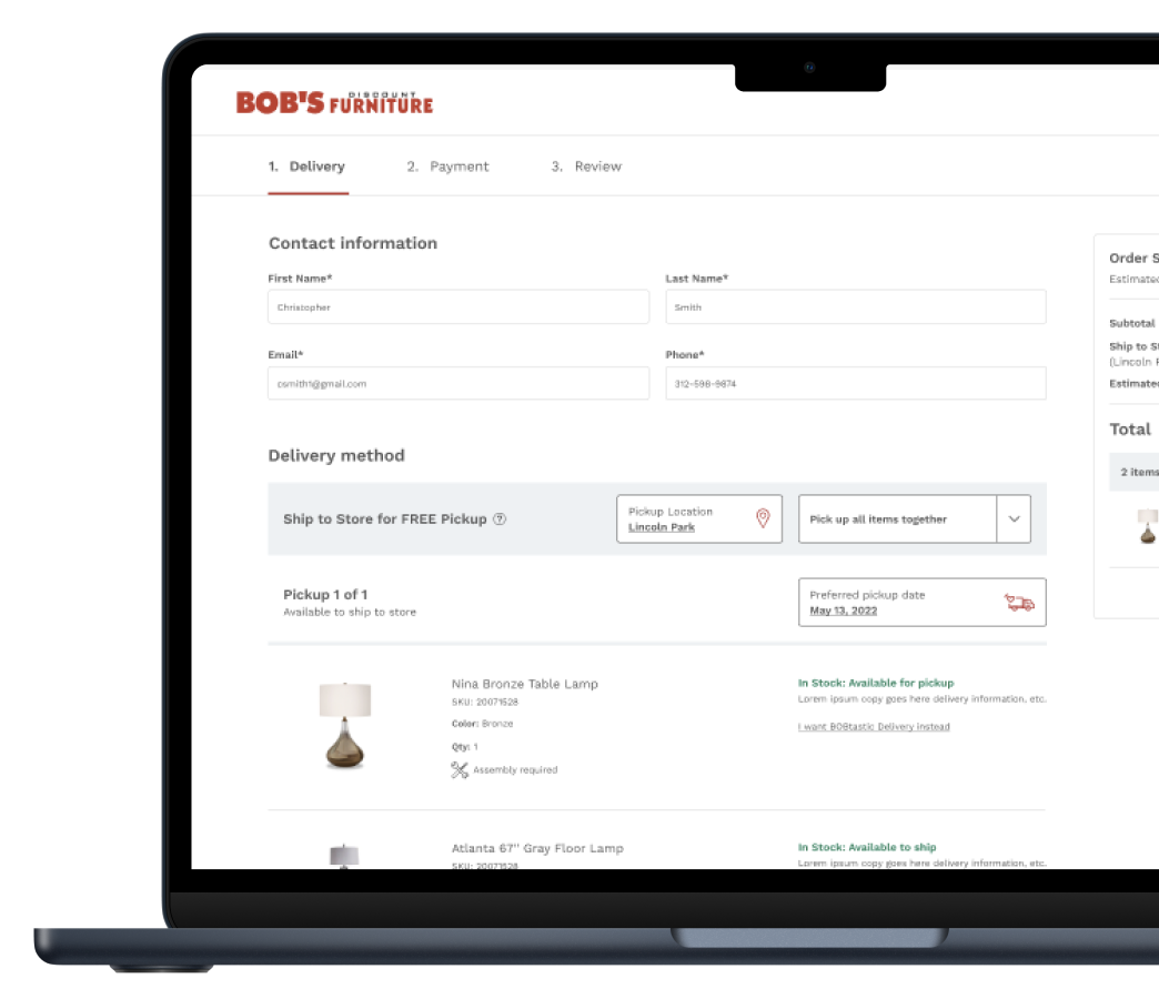
The result – shoppers now can not only schedule their delivery and pickup during checkout but also request line-item shipping preferences.
Creative Designs
Bob’s recently launched a new small store concept design and wanted the website style to align with the store experience, including it's iconic “Welcome to Bob’s” sign, core values, and sleep center.
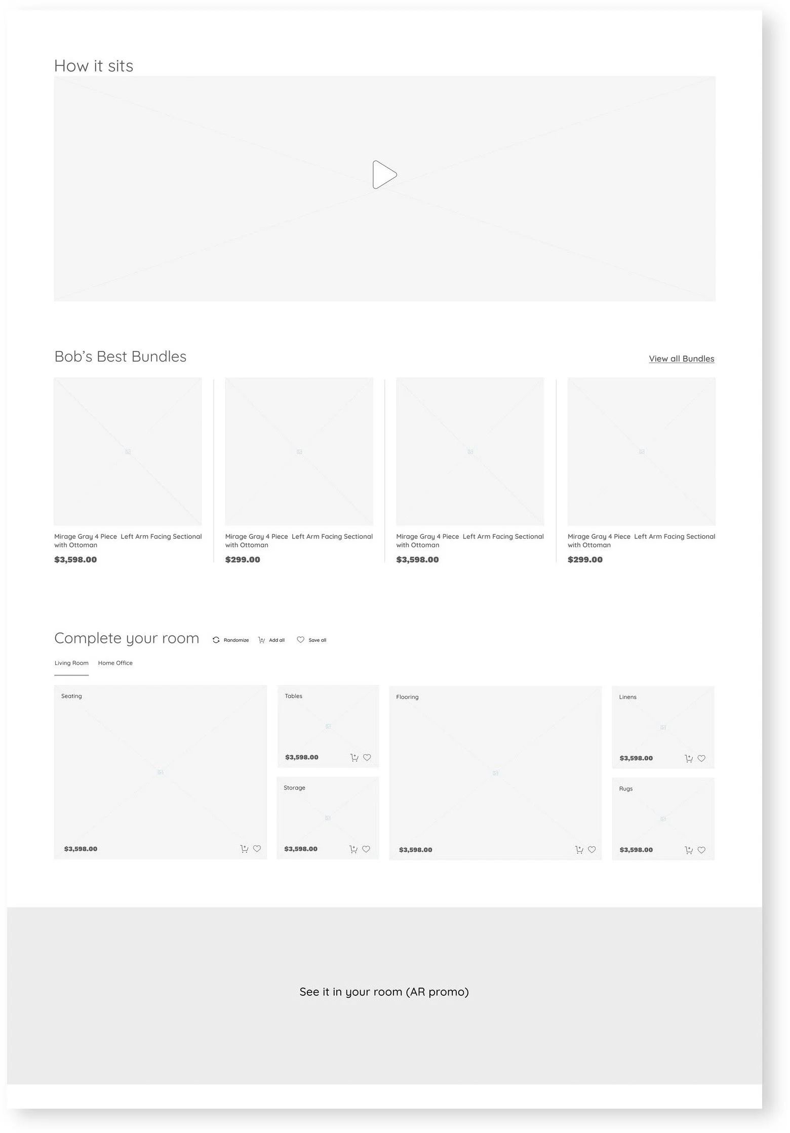
Low-Fidelity Wireframes
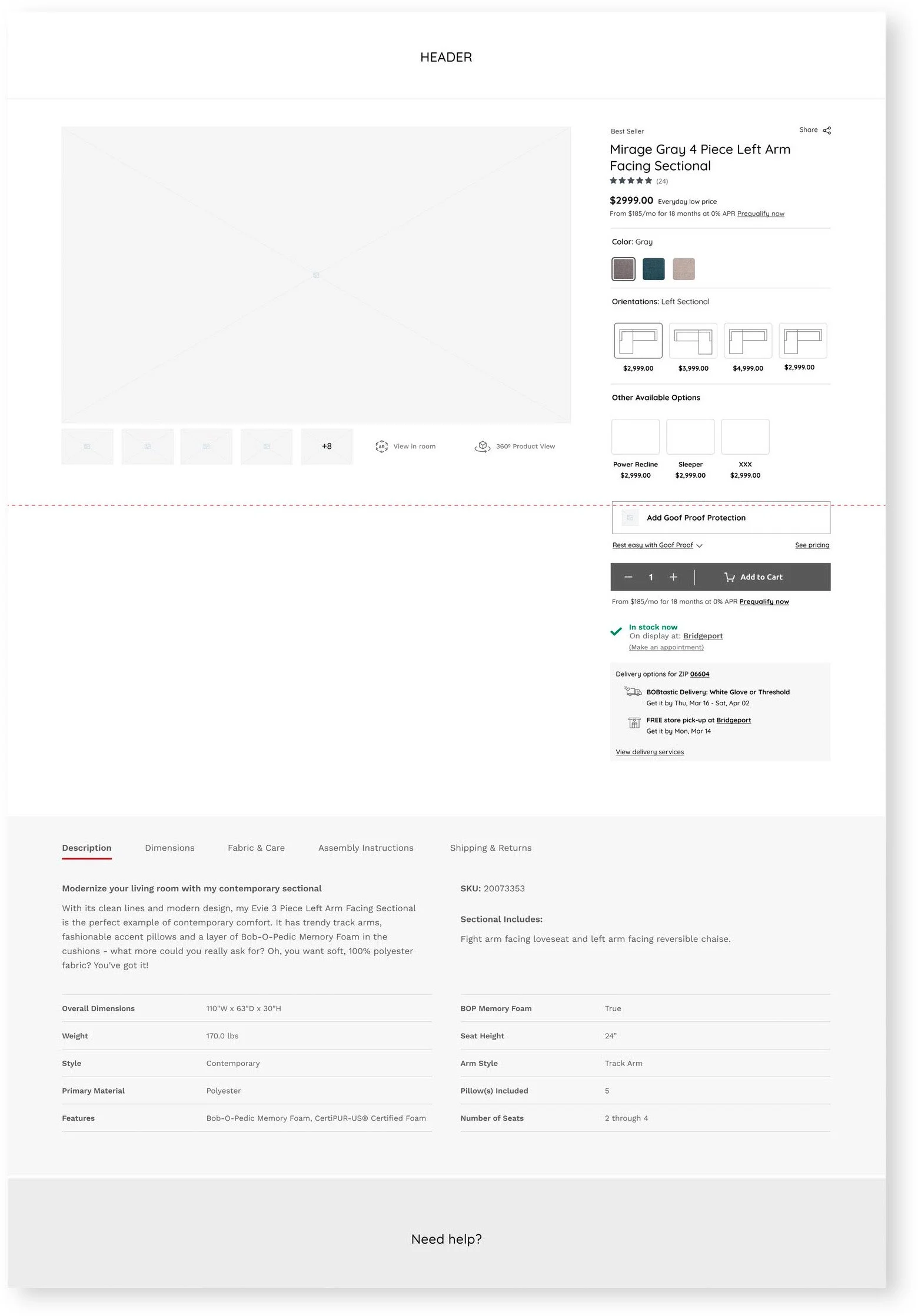
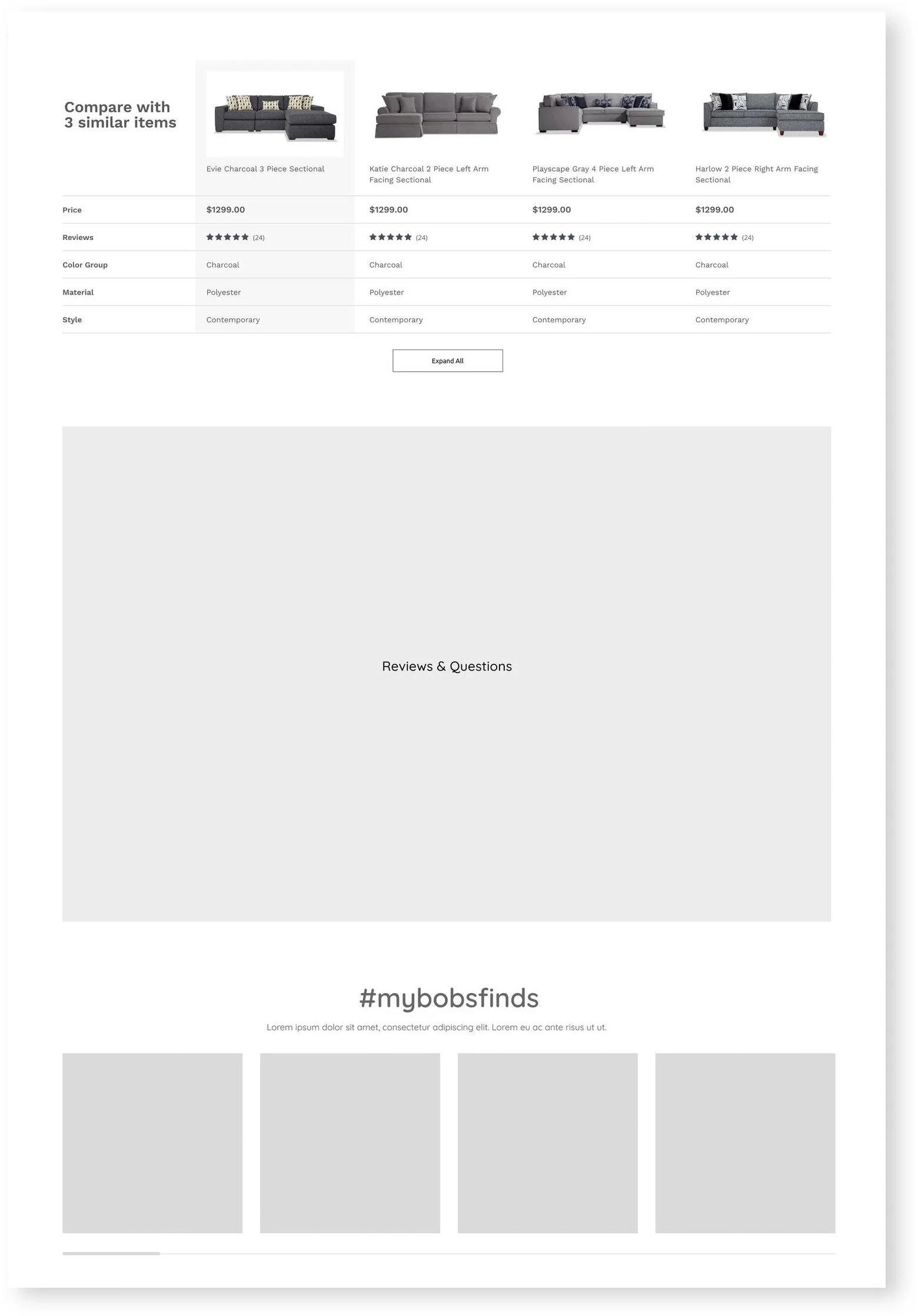
High-Fidelity Wireframes
The shopper can quickly select a subcategory and continue with their shopping journey
Interactive features to promote full-room selling
Aligned creative to the new store look and feel – especially for Bob’s new sleep centers
Mood board component design to elevate products
The mattress purchase experience
The then-current mattress-buying experience at Bob’s was disjointed, requiring the shopper to search for different product detail pages to complete a sleep solution.
We created a new, all-inclusive buy box experience that understands where the shopper is and gives them a quick way to select others—without changing the current back-end technology.
If the shopper lands on a mattress-only page and wants to purchase a foundation, they can quickly jump to a mattress set PDP and select their foundation. Instead of a regular page refresh, we used an Ajax solution so the change is more fluid for the viewer.
The shopper can quickly select a mattress only if they don’t want a complete set.
The shopper can complete their sleep solution with a mattress protector
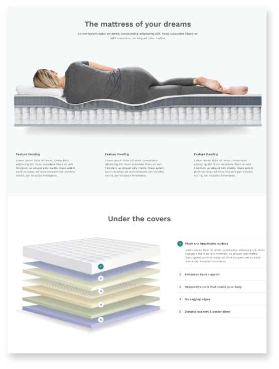
An interactive component showcases each layer of the mattress and explains each material.
The shopper can switch to other foundations and see what is compatible with their mattress selection without leaving the page.
The shopper can easily compare different types of mattresses, adding them to the cart instantly or going into the other options PDPs.
Checkout Flow
The Bob’s checkout flow was very complex, needing to allow a user to split purchases across multiple forms of payment as well as providing several delivery options, all while making it a seamless, smooth experience. But it was worth it—at the end of the day, a very complex challenge for us made a smooth, seamless experience for the user.
Users were making big purchases, and so financing was a big priority. We created custom payment calendars and approval screens for a bevy of conditions to be able to offer a smooth user journey from the cart to order confirmation.
The shopper can select the day of delivery before placing their order.
We created an order summary ledger showing each payment applied and a message if the shopper has an outstanding balance and needs to select an additional form of payment.
The thank you page had all the options for users to sign up for emails and use the new 3D virtual room to continue their shopping experience.


